
January 19, 2026
A DIY guide to creating LinkedIn image ads
With a basic grasp of a few core design principles, you don’t need to be a designer to create effective images for LinkedIn ads and posts.
Recently a friend had a problem with faulty mixer tap. This being London my friend couldn’t get a Plumber to come and look at the problem without a minimum call-out charge of ninety quid. If she’d opted to pay for the call out, no doubt some patronising clown in a boiler suit would have arrived – two hours late, shrugged, and said “you’ll need a whole new unit love”. Then charged her four hundred quid for the privilege of their expertise. Suffice to say, my friend decided to tackle the job herself and now she has a working tap and has saved herself four hundred quid – sorted!
If you are of a similar problem-solving mindset, you may not need the services of a Graphic Designer to create an image for your next LinkedIn ad or post. Below are some simple guidelines on creating a basic ad image. Why not give it a go yourself. The worst that can happen is you’ve wasted a couple of hours finding out graphic design or plumbing, is harder than it looks and you’ll feel less bad about paying a professional to do the job. If you are a Digital Marketing worker and you want to try your hand at creating an image then this post is for you.
Apologies to the plumbing community – but Londoners know what I mean right?
Right tools for the job
Pro-grade tools like Photoshop and InDesign are the professionals choice but they can be expensive and take some time to master. Newer tools like Figma, Affinity and Canva can give you more or less the same results for this simple ad but are free and more accessible to an occasional user.
For my workflow I use a combination of Figma and Photoshop. Photoshop excels in altering the background image but lacks the incredibly handy auto-layout feature of Figma. For this guide we don’t need Photoshop, Figma, Canva or Affinity will do.
What is important, is to understand that a few key design principals that will make our ad look professional and engage users.
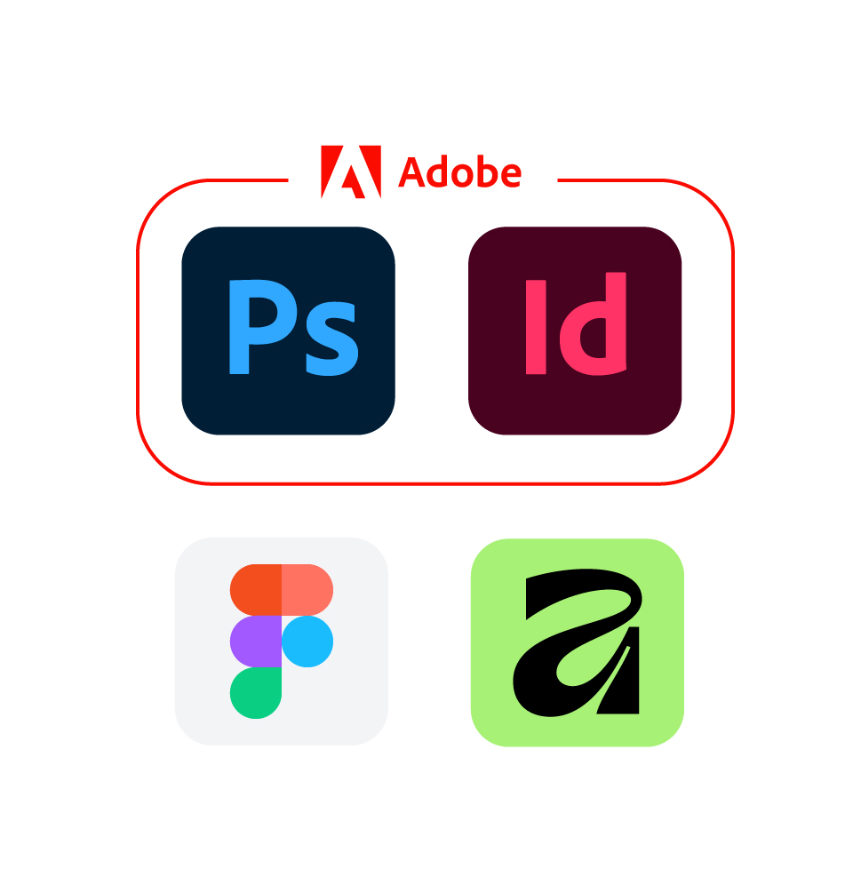
Adobe’s tools are facing competition from newer rivals
Ad size
If you want your ad to be legible on mobile as well as desktop, your ad should be portrait sized or square. A great all-round size is 1080 pixels by 1080 pixels. This is recommended by LinkedIn for static image ads for a 1:1 ratio. This ratio offers a good balance of screen coverage for both mobile and desktop.
Bonus tip: 1080 is also the height of a typical PowerPoint slide. This can come in handy if you need to include your ad in a presentation to your Boss or repurpose your ad for another social platform.
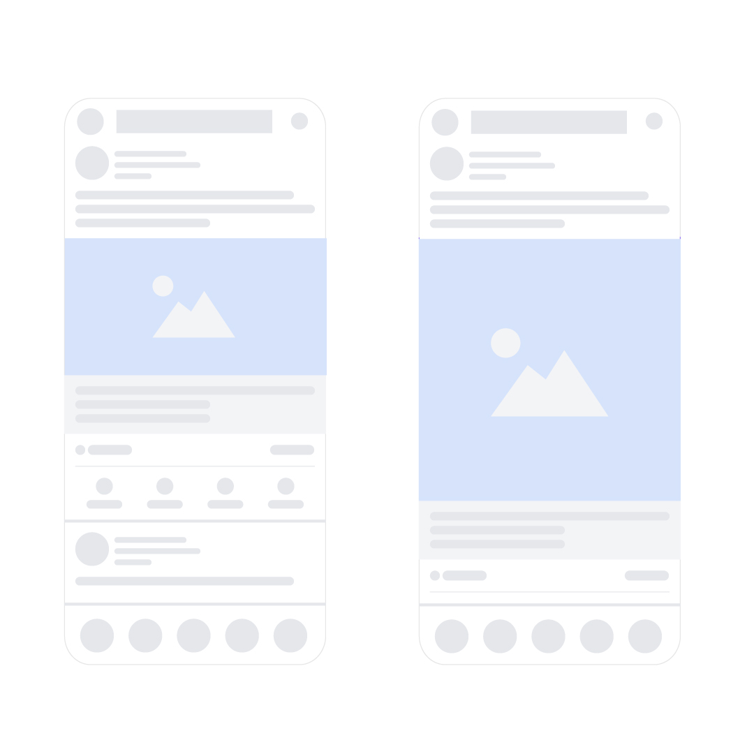
Square and portrait sizes work better on mobile screens
Creating a grid
Whatever tool you use, you’ll want to create a grid before you start. Aligning your design elements to a grid is the key to making your design look and feel professional.
A solid general purpose grid for this format of ad is the 8 point or 8 pixel grid. Methods differ between tools, but the grid setting can normally be found under your tool’s preferences or layout menu, grids and guides, then follow the instructions for creating an 8 pixel grid. You should then see an 8 pixel grid overlayed on your canvass. Use this grid and the spacing scale below to align your design elements.

The classic 8 point / 8 pixel grid
Margins
Using our 8 pixel grid to guide us, let’s create a margin. In this case we are going to position our design elements 64 (8×8 = 6.7% margin) pixels from the edge of the canvas. A good rule of thumb for social images is our outer margin should be roughly 5–8% of the shortest edge.
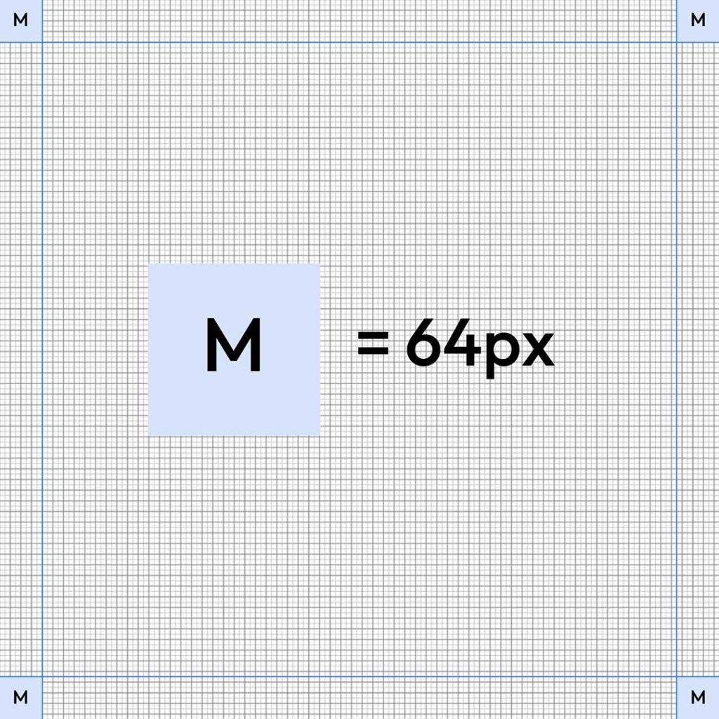
1080 x 1080 canvass with 64 pixel margins
Adding text
For maximum scannability on mobile I wouldn’t go below around 48 pixels for the ad body text. This size is hotly debated and some people might disagree with this advice but in my experience anything smaller than that can’t be scanned quickly. Our button text can be smaller because it’s a special case. Button text normally sits on a contrasting background colour and is surrounded by more white space. There’s no right answer to your text scaling, lots of factors will influence your design choices. A general rule is – the bigger, the better while trying to stick your your hierarchy. Note how our sizing is aligned to our 8 pixel grid.
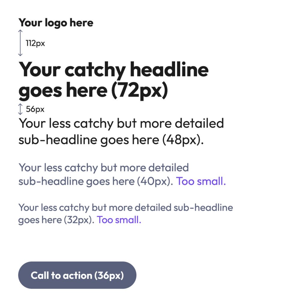
A 1080 x 1080 ad with suggested type size and scaling
Button scaling
For optimal viewing on mobile our call to action button should be about half the width of our ad. When scrolling on a mobile device take note of how this size relates to LinkedIn’s UI buttons. We want our buttons to be roughly the same scale. Mobile screens are sharper than desktops so we can get away with smaller text giving us more type hierarchy but I wouldn’t go any lower than 36 pixels as a rough rule of thumb. Button padding should follow our 8 point grid so let’s set our vertical padding to 16 pixels and our horizontal to 24 pixels.
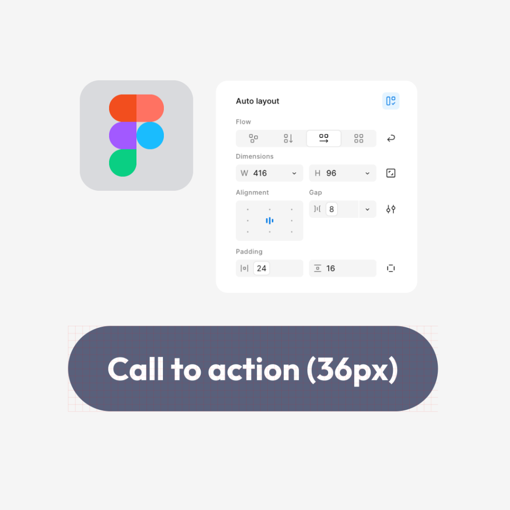
Figma’s auto-layout tool is a huge time-saver
Images
The main challenge with ad design is integrating the text and imagery. A typical approach is to place a background image covering the canvas, then position the text and other design elements on top of the image. Depending on the image this often requires a Graphic Designer to try various solutions so the text is readable over the image.
For our basic example, our image is composed in such a way that it’s straight forward to position the logo and ad copy and button over the image. If you’re not a professional Designer make sure you choose an image like this one that doesn’t require more complex adjustments to the placement of the logo and text and manipulation of the background image. The key to creating an ad like this is using an appropriate background image.
If you do find yourself needing to manipulate the image and text, at this point you probably require a professional Graphic Designer for that.
Our finished ad
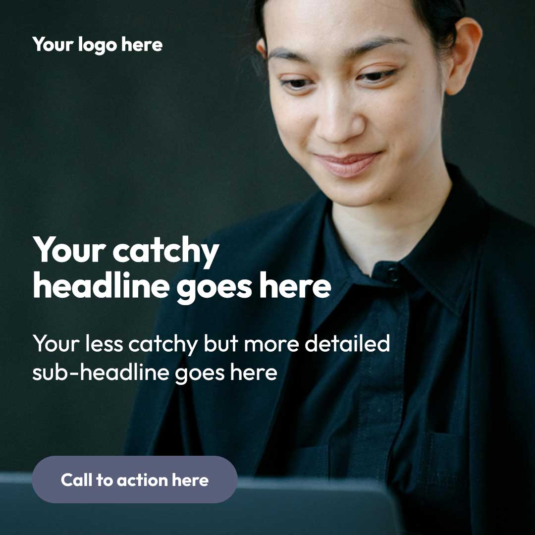
If we’ve followed our principals of layout and scaling, our finished ad should look something like this.

The final brand aligned ad