
April 30, 2026
New brand mark

I’ve finally got round to creating a brand mark that I’m pleased with – well pleased at the time of writing. The previous two iterations were an annoying combination of too rushed and too laboured.
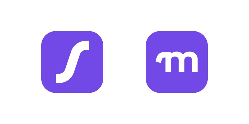
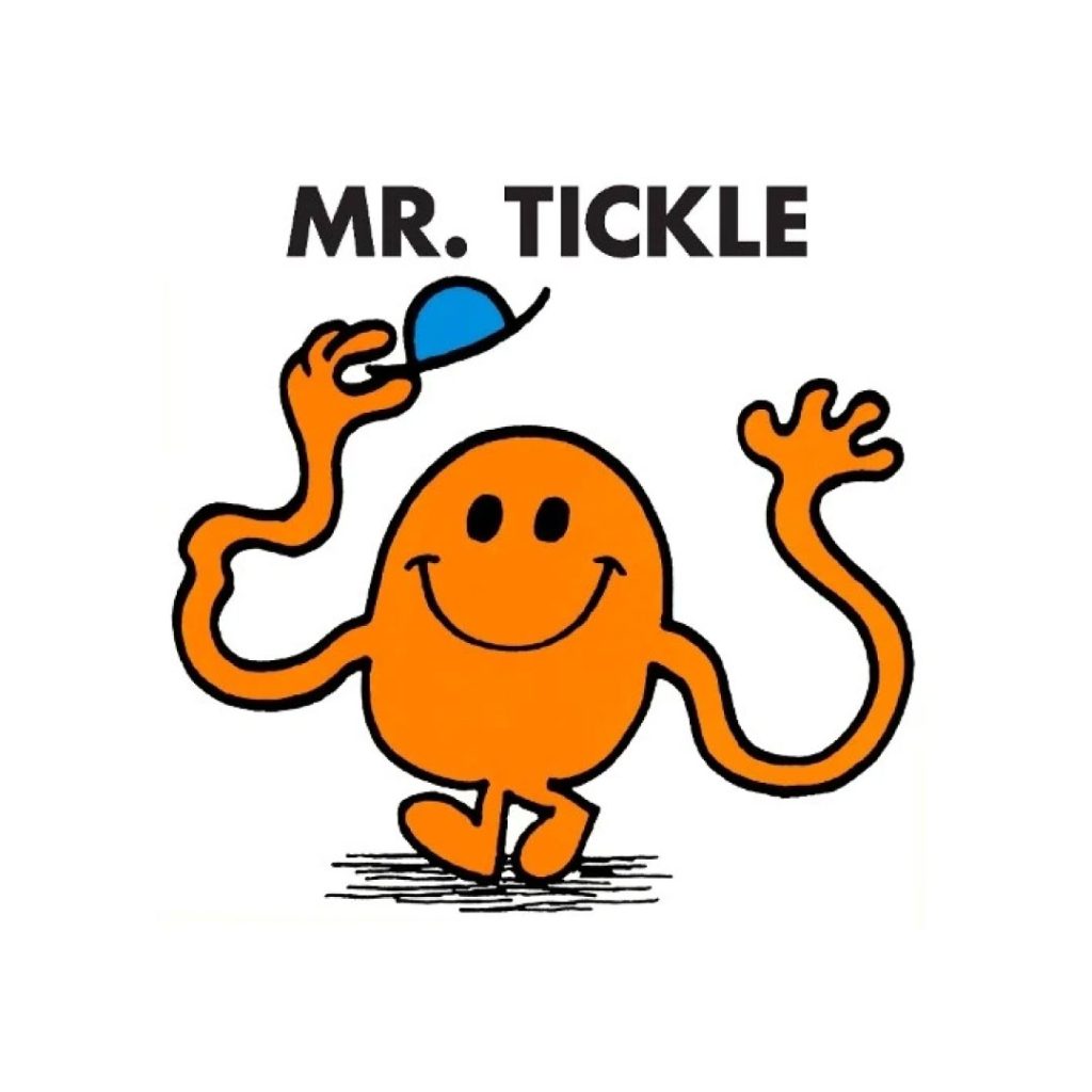
The new version is based on the ‘easing curve’ shape of the first brand mark. Part of the curve also made an appearance in version two as the custom serif on the letter ‘M’. This new mark takes the curve and rotates it around a central axis. I think it has a more playful and bolder feel to it. You see some of it’s DNA in this illustration of Mr Tickle – although I could have swore he was blue.
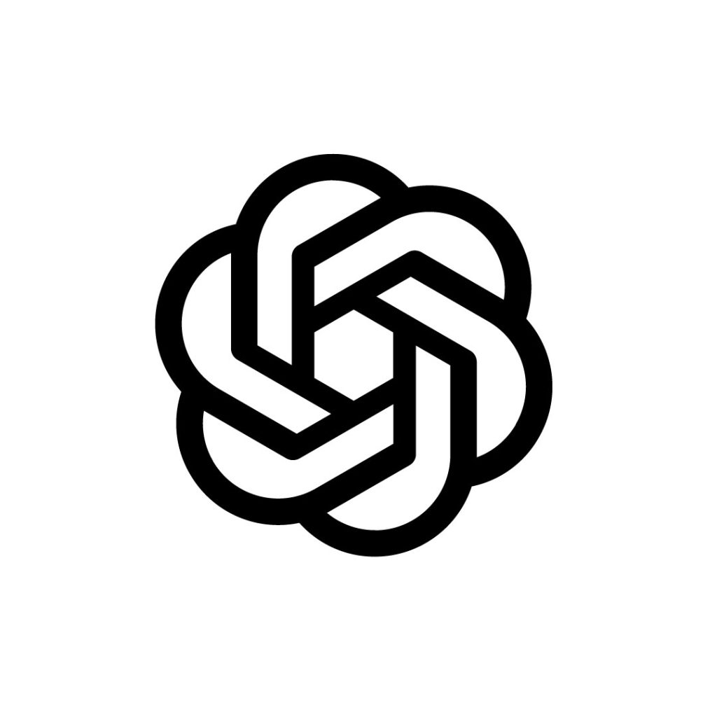
I was also inspired by a glance at my side bar in LinkedIn when I saw the Claude and OpenAI logos sitting next to each other. Both feature a radial motif. You could say that the new Mazle brand mark looks a little like the Claude and OpenAI logos had a baby together. I can see that.
If I was the baby of those parents I’d be a bit wary of annoying them too much. The OpenAI brand mark looks very much like the symbol of a dystopian regime. Something you’d see from draped flags lining pristine boulevards in domed city sometime in the near future.
The Claude brand mark is a lot less sinister. This doesn’t say killer robots, but I suspect the innocent crayon drawn sundial will wipe out most knowledge workers’ jobs just as fast as any army of androids.

My new brand mark has been designed with some practical considerations in mind. I’m hoping that outdrawing the stems of the vertical and horizontal curves of the brand mark will give me lot’s of flexibility to animate the shape later on. I can imagine some After Effects trim path action at some point and a morph into the full logotype.

As with all my logo design work, it has been created for digital first applications. No thin lines and no small details that get lost when reduced in size. Simple, bold, fun, solid – I’m pleased with it.
By the way, you should never make jokes about people’s babies, so if you think my new baby looks like a swastika on holiday in Ibiza – keep that thought to yourself.