
April 13, 2026
Why square images are best for LinkedIn social posts
Being a Digital Designer of several years I’ve seen ad formats evolve steadily.
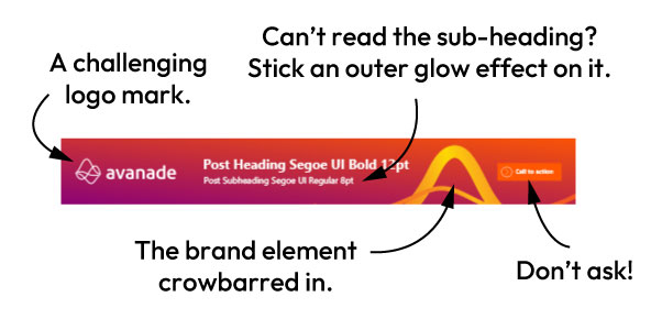
The once ubiquitous 468×60 pixels was a particularly challenging format because of it’s extreme aspect ratio. Designers had to cram in: a logo, a headline, a sub headline, a button – and some kind of relevant image into those dimensions. Yes it can be done but the results were often, ‘sub-optimal’ to put it kindly. Creating a design that was legible usually involved a lot of Photoshop hacks. Some of my favourite techniques included, behind text solid colour blocks, gradient fills over background photography and my personal get-out-of-jail card – adding a subtle outer glow behind the text. All of these techniques were utilised in a desperate attempt to make the type legible. It was gruelling and thankless work – although not as hard as a proper job like being a plasterer or a nurse.
The rise of smartphones
Higher screen resolutions and the rise of smartphones have just about killed off the 468×60 ad format, although there are still few corners of the internet where it’s still around.
Smartphone use in particular has led to the increase of square and portrait sized ads. That’s because smartphones are used primarily in portrait orientation. With this in mind, I’m going to make the case for using a square ad format. Square ads, in my experience, offer the best trade-off in terms of speed of production, flexibility and legibility. Obviously as with all things related to digital marketing – most of my reasoning could be out of date by this time next week!
Screen space
Ideally as Designers of digital ads we’d want to take over the entire screen of any device we are creating ads for. Whether that’s a TV, outdoor digital display, or smartphone. With a smartphone however it’s not that simple. It’s not possible or desirable because our screens also need to accommodate various UI elements to allow us to operate the device, show the device status and navigate content we’re consuming.
Why square is better than portrait for LinkedIn
Mobile-first platforms like Instagram and TikTok offer users the ability to post content in portrait format. Many other platforms have followed due to the explosion of user shot portrait mode video content. Witness the rise in reels and shorts. I’d argue however that a portrait image ratio is less suited to a LinkedIn post.
In the case of LinkedIn, a post consists of not only the image or video, but the poster’s bio, and a section that shows what reaction the post has received. Both of these areas give the post context, who posted, and what are the reactions.
Because both these contextual areas take up vertical space, it makes sense to create an image size that allows as much as all three areas, the bio, the image and the reactions to be seen at once – a square image does that.
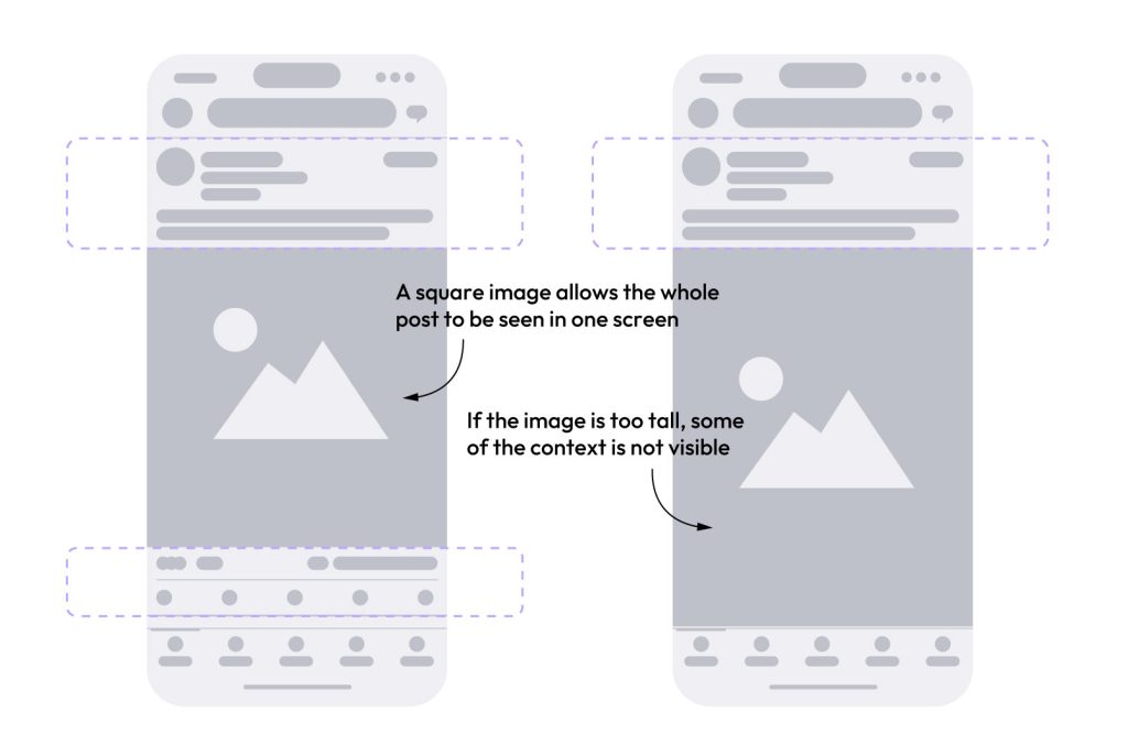
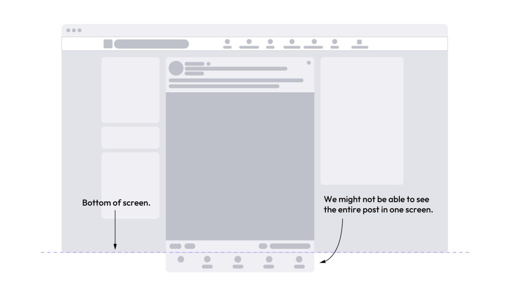
A square ad has another advantage. We can see the entire image on desktop as well mobile. A portrait sized image might be too tall, pushing the the bottom of the image off the screen on desktop. This means we can’t the the whole image at once.
So for both those reasons my argument is square beats landscape for LinkedIn – but I’ll admit that these arguments can be challenged.
Square versus landscape
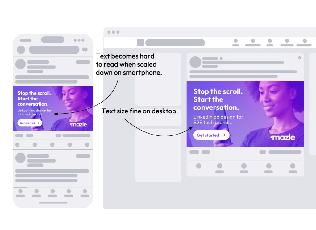
Square versus landscape is an easier argument to make. An important advantage a square ratio has over a landscape sized image is that any text incorporated in a landscape design will scale down relative to the aspect ratio of the image. This means text that is easy to read on a desktop device becomes more difficult to read on a smartphone. What’s the point of spending all that time and money on an ad where the text is hard to read.
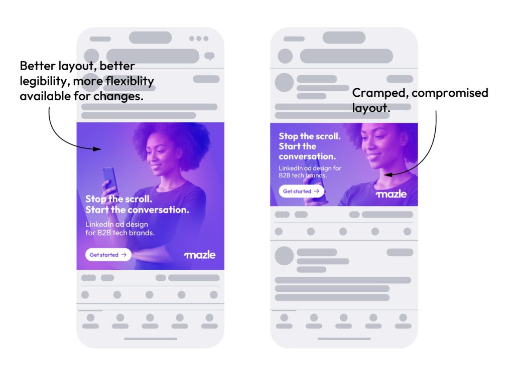
Because of this scaling issue, a square ad has another advantage up is’t sleeve. There’s more vertical space to play with and therefore more flexibility for your design. This additional space offers more layout options, and improved type hierarchy.
This flexibility comes in particularly useful when your ad features a full cover background image.
Hopefully I’ve convinced you that square beats landscape if you want your ad to work on a smartphone and desktop. The argument for square over portrait, I admit, is a little harder to win. There are good arguments for taller portrait style formats. Instagram’s 1350×1080 is a worthy contender for the title of best all-rounder. I’d still argue however that overall, a square image or video is the best choice of format for your next LinkedIn post.